


A scroll-snapping, loopable, autoplaying, keyboard-navigable, fullscreen-ready horizontal carousel custom element.
No dependencies, about 13kB minified and gzipped.
Download the latest release:
github.com/stephband/slide-show/releases
Then include the JS and CSS files:
<link rel="stylesheet" href="./build/element.css" />
<script type="module" src="./build/element.js"></script>
You can now use the <slide-show> in your HTML. The <slide-show> example
above looks something like this:
<slide-show autoplay loop controls="navigation pagination fullscreen">
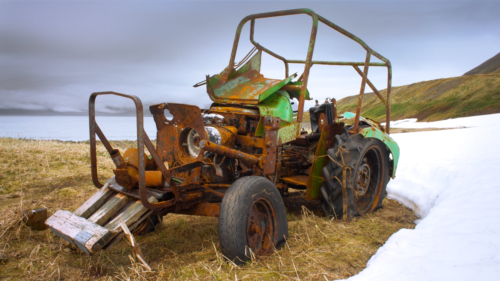
<img src="./images/donkeys.jpg" draggable="false" />
<img src="./images/tractor.jpg" draggable="false" />
<img src="./images/mauverin.jpg" draggable="false" />
</slide-show>
A <slide-show> lays out its children horizontally, by default in grid layout.
Content is horizontally scrollable via touch or trackpad, draggable with a mouse
(making it a Good Idea to add draggable="false"to images and links), and also
navigable via keyboard focus.
A <slide-show> is not just for images. Content may be any HTML. Here’s a
<slide-show> being employed as tabbed navigation:
active ="#id"
Sets the initial scroll-snapped slide, where #id must be the id of a
direct child of the <slide-show>.
<slide-show active="#tractor">
    <img src="./images/tractor.jpg" draggable="false" id="tractor">
</slide-show>
autoplay
Boolean attribute. When present the slide-show activates the next
slide after a pause.
<slide-show autoplay>…</slide-show>
The pause duration may be set with the CSS variable
--slide-duration. Autoplay is also paused when a mouse pointer is
inside the slide-show, or when a slide has focus.
controls
An attribute that accepts the tokens "navigation", "pagination"
and "fullscreen". The presence of one of these tokens enables the
corresponding controls.
<slide-show controls="navigation fullscreen">…</slide-show>
loop
Boolean attribute. When present, the slide-show behaves as a continuous
loop.
<slide-show loop>…</slide-show>
Looping works by duplicating some of the children of the slide-show.
Duplicate elements are given aria-hidden="true" and tab-index="-1", and
have id attributes stripped off in an attempt to make them inert.
.active
Gets or sets the currently scroll-snapped slide.
const activeSlide = slideshow.active;
May be set to one of the child elements, or to the id of one of the
child elements, causing the slide-show to scroll.
slideshow.active = 'slide-1';
.autoplay
Boolean property. When true the slide-show activates the next
slide after a pause. The pause duration may be set with the CSS variable
--slide-duration. Autoplay is also paused when a mouse pointer is
inside the slide-show, or when a slide has focus.
slideshow.autoplay = true;
.controls
A TokenList object (like .classList) that supports the tokens
"navigation", "pagination" and "fullscreen".
slideshow.controls.add('pagination');
.loop
Boolean property. When true, the slide-show behaves as a continuous loop.
slideshow.loop = true;
Looping works by duplicating some of the children of the slide-show.
Duplicate elements are given aria-hidden="true" and tab-index="-1", and
have id attributes stripped off in an attempt to make them inert.
.activateNext()
Activates the next slide.
.activatePrevious()
Activates the previous slide.
"slide-active"
Emitted by a slide when it is brought into scroll-snap alignment.
::part(previous)
Style the ‘previous slide’ button, available when the slideshow has
controls="navigation" enabled. Default button icons are inner SVGs that
render stroke as currentcolor and inherit stroke-width, stroke-linecap
and fill properties from the button.
slide-show::part(next) {
    color: blue;
    stroke-width: 3px;
}
To fully replace the default icon, see slot="previous".
::part(next)
Style the ‘next slide’ button, available when the slideshow has
controls="navigation" enabled. Default button icons are inner SVGs that
render stroke as currentcolor and inherit stroke-width, stroke-linecap
and fill properties from the button.
slide-show::part(next) {
    color: blue;
    stroke-width: 3px;
}
To fully replace the default icon, see slot="next".
::part(pagination)
Style the pagination wrapper.
::part(page-button)
Style the pagination buttons, available when the slideshow has
controls="pagination" enabled.
::part(page-button-active)
Style the pagination button pointing to the active slide, available when the
slideshow has controls="pagination" enabled.
::part(fullscreen-button)
Style the fullscreen button, available when the slideshow has
controls="fullscreen" enabled. Default button icons are inner SVGs that
render stroke as currentcolor and inherit stroke-width, stroke-linecap
and fill properties from the button.
slide-show::part(fullscreen-button) {
    color: blue;
    stroke-width: 3px;
}
To fully replace the default icon, see slot="fullscreen-button".
--slide-duration
Sets the display duration of a slide when the slideshow has
controls="autoplay" enabled. May be a CSS time value in s or ms.
slide-show > img {
    --slide-duration: 12s;
}
If applied to the slide-show itself, sets the display duration of all
slides.
slide-show {
    --slide-duration: 12s;
}
--padding-left
Adjusts the space to the left of the leftmost slide, and the alignment
position of slides set to scroll-snap-align: start. (Internally it sets
both padding-left and scroll-padding-left while enabling a workaround for
some browser inconsistencies.)
slide-show {
    --padding-left: 3rem;
}
--padding-right
Adjusts the space to the right of the rightmost slide, and the alignment
position of slides set to scroll-snap-align: end. (Internally it sets
both padding-right and scroll-padding-right while enabling a workaround
for some browser inconsistencies.)
slide-show {
    --padding-right: 3rem;
}
slot="previous"
Available when the slideshow has controls="navigation" enabled, this slot
allows the inclusion of html content into the ‘previous’ navigation button. By
default the slot contains an inline SVG of an icon, and some text (in English).
Defining HTML for the slot replaces that default content:
<slide-show controls="navigation">
    <svg slot="previous" aria-hidden="true">
        <use href="#back-icon" />
    </svg>
    <span slot="previous">Dernière</span>
</slide-show>
slot="next"
Available when the slideshow has controls="navigation" enabled, this slot
allows the inclusion of html content into the ‘next’ navigation button. By
default the slot contains an inline SVG of an icon, and some text (in English).
Defining HTML for the slot replaces that default content:
<slide-show controls="navigation">
    <svg slot="next" aria-hidden="true">
        <use href="#forward-icon" />
    </svg>
    <span slot="next">Prochaine</span>
</slide-show>
slot="fullscreen-button"
Available when the slideshow has controls="fullscreen" enabled, this slot
allows the inclusion of html content into the fullscreen button. By default the
slot contains an inline SVG of an icon, and some text (in English). Defining
HTML for the slot replaces that default content:
<slide-show controls="fullscreen">
    <svg slot="fullscreen-button" aria-hidden="true">
        <use href="#fullscreen-icon" />
    </svg>
    <span slot="fullscreen-button">Plein écran</span>
</slide-show>
<slide-show> is built to scroll, and if JavaScript
fails and the features of the element do not initialise (the component
is not 'upgraded' in Web Component parlance), the user nonetheless gets
a scrollable element. Fallback style is provided by ./build/element.css.
Upgraded style is provided by ./build/shadow.css, which
must be in the same location as ./build/element.js in order
to be loaded into the slide-show's shadow DOM.
The release includes JS files for registering customised built-in versions of the slide-show.
Note that these don't register the same way in all browsers – Safari does not support customised built-ins, so support is roughly polyfilled. Mileage may vary; please file an issue if you find a problem.
The package includes a basic polyfill of element.scrollTo(),
as Safari lacks support for the smooth scrolling option of this method.
The polyfill is not applied in browsers where smooth scrolling is already
supported.
Support development: Sponsor
github.com/stephband/slide-showgithub.com/stephband/slide-show/issuesBuilt by Stephen Band for Cruncher.
Documentation set in Euclid
and Martian Mono. Fonts
used for documentation not included as part of the license covering the
use of slide-show.